
Whole 2.0: a fresh start
I rebuilt a large part of Whole. New look, new charts, and a lot of small things that make tracking your net worth calmer.
Whole has been around for a while, and it was showing. For 2.0 I rebuilt most of the app: every screen, every chart, and the way your data is stored. Here’s what you’ll notice.
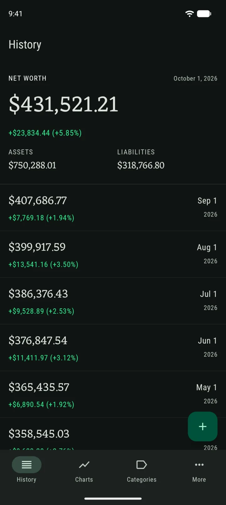
A new look
The main screens got a fresh, more modern design. The records list is easier to scan, and your current net worth takes the spotlight.
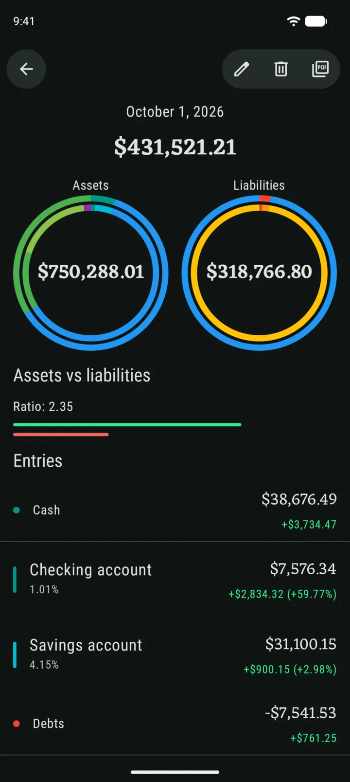
Records you can read at a glance
The record details now show two rings, one for assets and one for liabilities, each split by category.
Charts, rebuilt
The charts are new too, with easier period controls. Pick a period, step back and forth, and see charts move.
Keep old categories without the clutter
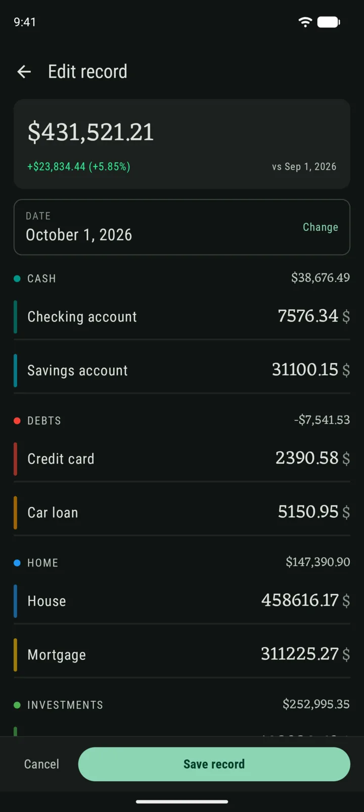
You can now Archive categories instead of deleting them. An archived category disappears when you add new records, but stays in your history, so your past net worth is unaffected. You can bring it back any time.
An easier start
New to Whole? You start with a few ready-made categories and can add your first record straight away. No long tutorial to swipe through.
— Gianmarco